The Science of Color as it Pertains to Retro Reflective Signs

Color is a universal language. At traffic lights across the country and around the world, drivers understand to stop on red and to go on green. For signs, drivers recognize yellow as caution, red as stop, white as the speed limit, and green as information. These colors and the shape of the sign convey a message before we see what is written on the sign and keep us safe as we drive on American highways.
In the field of retro reflective sheeting on road signage, color consistency is very important. It is for this reason that in the US, sheeting used on signs must meet ASTM standards. This is because a yellow yield sign in Montana needs to be the same color as a yellow yield sign in Florida, and a red stop sign in New York needs to match the color of one in California.
Note – Sign shapes are specified by the MUTCD (manual for uniform traffic control devices) Color, reflectivity and other attributes are specified by ASTM (American society for testing and materials) ASTM sets standards, and other organizations such as state DOT’s require adherence to those standards. This is all done for safety and uniformity.

So why the stringent color requirements? Humans respond to color, and since the eye is so sensitive to it, even slight differences are noticeable. So if a yellow on one yield sign is different from another, a person will notice. And if the differences are substantial enough, one sign may be disregarded by the human brain. This is because much of color recognition in traffic is subliminal or automatic. So color is important.
Note – to test your color sensitivity, look for cars that have been wrecked and repainted. If only a door was damaged and repainted, you will most likely be able to sense a slight difference in color, even though the body shop made great efforts to match. Or in your home, when you have colors matched at Lowes and go to touch up a room, you will see a difference and often have to paint and entire wall to get a match.
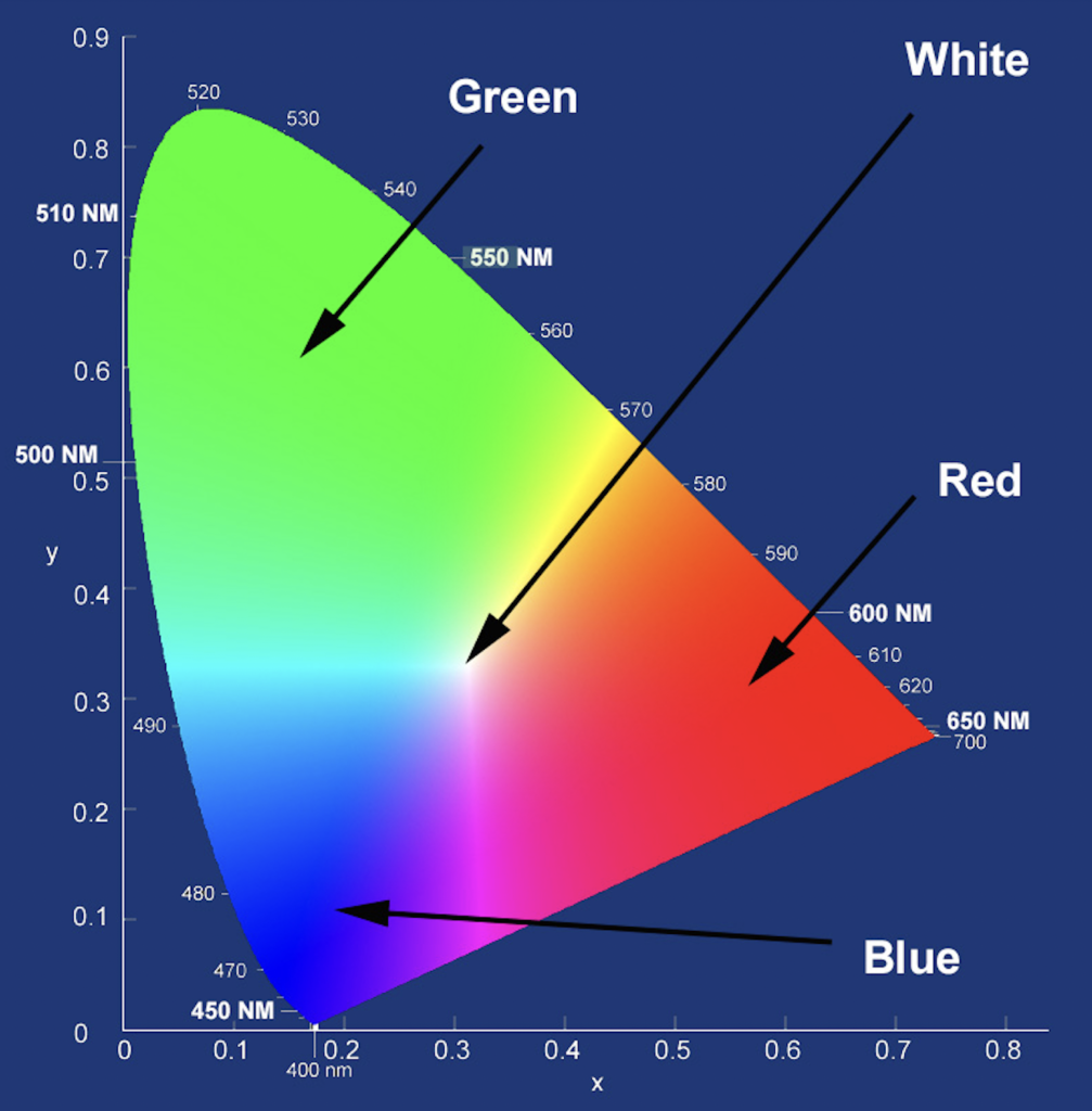
The colors of sign sheeting are measured in terms of Chromaticity. Chromaticity is defined as an objective, numerical indicator of the quality of a color that stays constant without regard to the light that illuminates it. In other words, it is the quality of color of an object, independent of brightness. Color science uses chromaticity to explain and quantify how we determine different colors. It breaks down colors into metrics, or numbers. Chromaticity measurements and metrics also make colors reproducible with consistency. Consistent chromaticity confirms that an object emits the color you need to see, which for things like sign sheeting, are very specific.

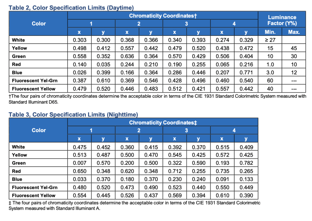
For retro reflective sign sheeting to be approved for use on highways, certain specifications must be met. Weatherability, Reflectivity, Daytime Chromaticity (color), Nighttime Chromaticity (color) Adhesion, Shrinkage, Solvent Resistance and Specular Gloss are some of the specs. Of these, Chromaticity is one of the more important metrics, as is reflectivity. So sign sheeting must be tested for compliance before it is approved. This assures that all sign sheetings, regardless of the manufacturer, fall within certain parameters. So whether a sign is sheeted with Retro Reflective film from Avery, Orafol, Nikkalite, or 3m, they will look almost exactly the same.
How Chromaticity is Measured
Chromaticity is a combination of two measurements. One is hue, which is formally described as the property of colors by which they can be perceived as ranging from red through yellow, green, and blue, as determined by the dominant wavelength of the light. These colors can be described in terms of the wavelengths that create them, and for uniformity, wavelength can be objectively measured and quantified.
The other measurement that goes into chromaticity is “colorfulness”. Colorfulness is the attribute of a visual perception according to which the perceived color of an area appears to be more or less chromatic. This just means that color is dependent on more than the wavelengths of light that are being reflected to the human eye, it also depends on the intensity of the light falling on the surface that is reflecting them. During tests for chromaticity for sign sheeting, a constant level of a certain kind of light is maintained for uniformity.
When testing for Chromaticity, a “CIE D65 Standard Illuminant” compliant light source is used. It simulates the color of sunlight on a slightly hazy day. 4 tests must be done and the results of each recorded to qualify a material to meet ASTM color specification standards.
Eye Sensitivity
The perception of color by the human eye is the one factor that engineers have no control over. The perception or recognition of color begins when light hits the retina, which contains photoreceptors called rods and cones. Rods are more sensitive and are responsible for our low-light or night time vision. Cones are less sensitive and are responsible for our day time and color vision. As light strikes the photoreceptors in the human eye, a nerve impulse is sent to the brain, which interprets the light according to its color.
Note – Numerous tests have shown that Fluorescent Lime is seen by the human eye more prevalently than other colors. Lime and Red together provide the best contrast and the quickest recognition. This is why you see lime and red used on the backs of fire apparatus.
Summary
In summation, color chromaticity standards assure that people recognize the intention of a sign both day and night, prior to being able to read what it says. Both the shape and color of the sign assist in making this happen. It is for this reason that all 50 states require conformance to ASTM color and reflectivity standards when it comes to retro reflective sign sheeting.
Not all retro reflective tape has to meet these standards. Only sign sheeting. Other tapes are used for a variety of other purposes such as vehicle conspicuity and marine safety. For these tapes and applications, other regulations often apply.